Mix and match Mixed media on CD's 2020 6"x 6"


I created this piece because I saw it and I thought it was cute. But I took my own spin on it and created my own small designs for the CD’s that represent me and the things I like. The reason I used the colors I did was because I am a bright person most of the time so I wanted to represent that and use unity so all the CD's go well together.
Have the time of your life Acrylic paint on chipboard 12"x 12" 2021
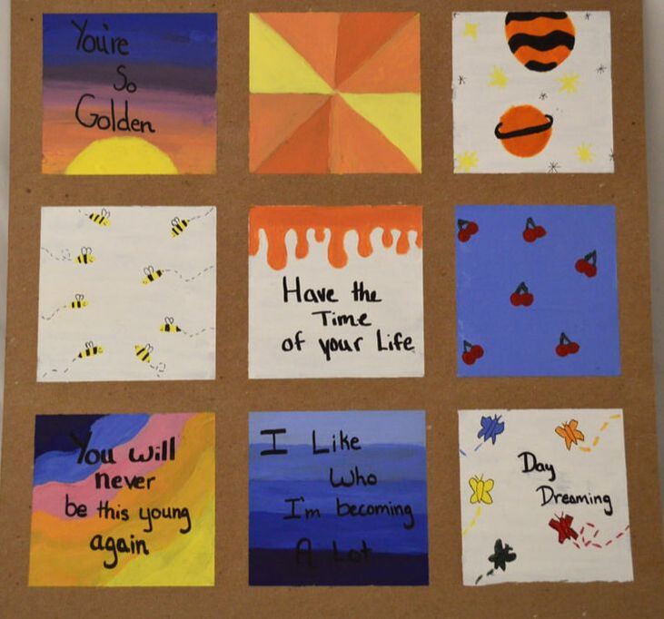
I sketched boxes and made designs that I liked that also relate to me. I added quotes to the boxes that I thought needed more to them. I added quotes to the ones that seemed not as balanced as the other squares. I used colors that go well together and that complement each other so the project has unity. I picked colors that I like and that go well together and are bright.
Emotional Butterflies acrylic paint on chipboard with acrylic paper 9"x 10" 2021
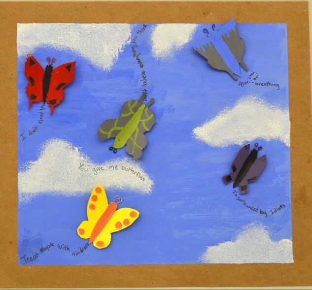
I like butterflies and there are a lot of different shapes, sizes, and designs of butterflies. I decided to focus on emotions because everyone goes through a lot of emotions all the time. The red butterfly represents anger. To show this emotion I used dark colors and sharp edges. The yellow butterfly is happy. I used soft round edges and light colors to show this. The green butterfly is confused. I used squiggly lines and edges with the green color to show this. The blue butterfly is the sad one. To show sadness I did drips to represent tears. The purple butterfly is the independent one that doesn't need anyone for anything. I used unique edges and a very different color to show this. I thought this would be a piece everyone can relate to.
